
When Canceling Your Subscription Becomes a Maze
A UX Practitioner’s Reflection on Broken Promises and Digital Trust

I needed to cancel my RunwayML subscription. I’d signed up for their $15/month Standard plan to test some video work, and after finishing my project, it was time to move on. What followed wasn’t just frustrating—it was a masterclass in how broken UX patterns erode trust.
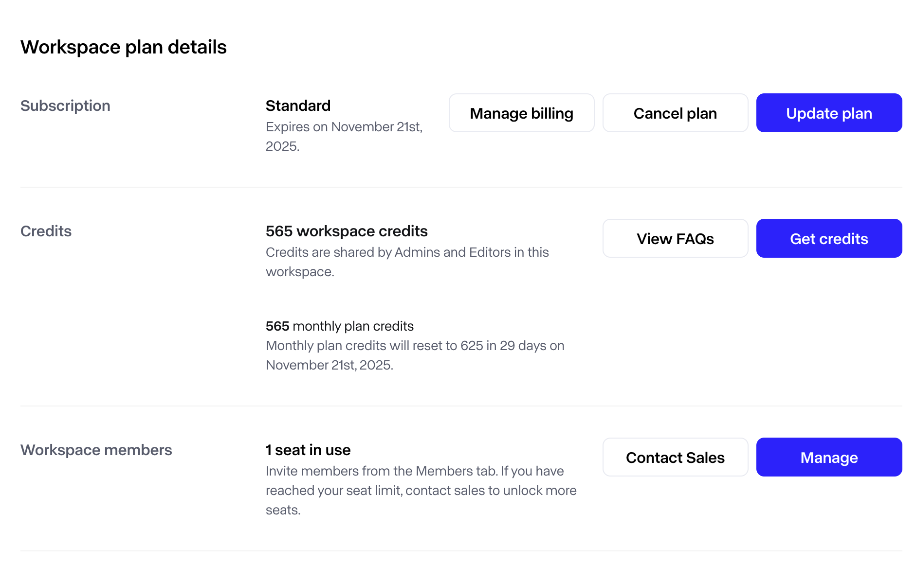
The Workspace plan details page showed a clear Cancel plan button positioned prominently alongside “Manage billing” and “Update plan.” I clicked it.
The system took me to a subscription management page that displayed my plan details, end date, and two action buttons: “Update subscription” and “Don’t cancel subscription.”
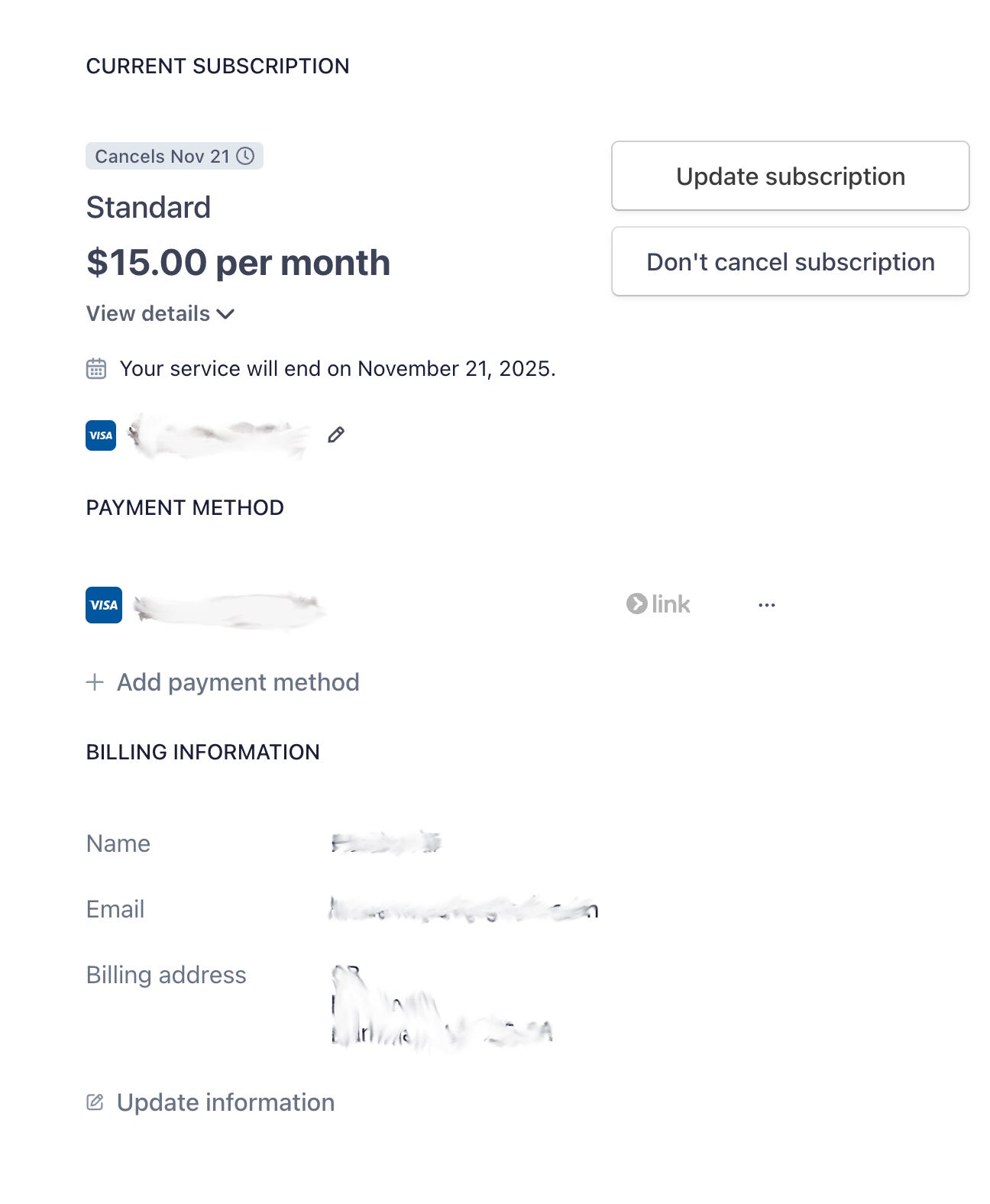
Notice what’s missing? An actual way to cancel.
The UI promised me a cancellation flow. The reality delivered a page designed to prevent exactly that action. After cycling through several screens—back to workspace settings, into billing information, hunting through payment methods—I still couldn’t find the off-switch. The “link” option next to the payment method suggested I’d need to navigate into a Stripe portal somewhere, but that path wasn’t marked or obvious.
This wasn’t just poor UX. It was a broken promise, executed in real-time.
The Anatomy of a Broken Promise
Over two decades of working in design and product development, I’ve witnessed the gap between what systems promise and what they deliver. This RunwayML cancellation flow exemplifies five critical failures that compound into user distrust:
Broken information scent. The button label says Cancel plan. The destination page offers Don’t cancel subscription. That’s a promise broken in one click. Information scent—the visual and textual cues that guide users toward their goals—works only when the trail leads somewhere. When it dead-ends with the opposite action, users don’t just feel lost; they feel manipulated.
Affordance mismatch. Primary CTAs signal irreversible actions. We’ve trained users for decades to expect that a prominent “Cancel” button means “end this now.” Using such buttons to navigate to a page that discourages cancellation violates that learned expectation. The cognitive load isn’t just about finding the right path—it’s about relearning what buttons mean in this particular system, and questioning whether the system is trustworthy at all.
Invisible system boundaries. The product appears to offload cancellation to Stripe’s customer portal without making that handoff explicit. If completing a core task requires leaving your application, that transition must be clearly marked and seamlessly executed. The small “link” label next to the payment method hints at this, but it’s buried in a section labeled “Payment Method”—not “Subscription Management.” Users looking to cancel aren’t scanning for payment links; they’re looking for cancellation controls.
No end-state preview at the decision point. When I clicked “Cancel plan,” I expected to see what would happen next: confirmation of my end date, clarification that I’d keep access until November 21st, and assurance I wouldn’t be charged again. Instead, I saw subscription details I’d already read and a button telling me not to do what I came to do. The absence of clear next-step information doesn’t just create uncertainty—it converts a straightforward business transaction into an anxiety-inducing maze.
Compounding frustration. Confusion at cancellation time doesn’t merely generate support tickets. It transforms satisfied users into vocal critics. I completed my video project successfully. I had no complaints about RunwayML’s core functionality. But this final interaction—this moment where the system actively worked against my clear intent—colors the entire relationship. What should have been a neutral exit became a story about deceptive UX I’m now sharing publicly.
Why This Matters Beyond UX
In my book Unfinished, I explore how established frameworks often persist long after they’ve stopped serving us. The cancellation UX pattern I encountered isn’t accidental—it’s the product of misaligned incentives, technical debt, and a fundamental misunderstanding of what retention actually means.
Making cancellation difficult isn’t a retention strategy. It’s borrowed time, paid back later in damaged reviews, eroded brand trust, and regulatory scrutiny. Real retention starts with an honest off-switch. When users trust that leaving is as simple as staying, they’re more likely to return when their needs change.
After decades of studying how people interact with digital systems, I’ve come to understand that friction at critical moments reveals organizational priorities. When a company makes it hard to leave, they’re saying: “We don’t trust our product to bring you back.” That admission echoes through every subsequent interaction—and in my case, through this very article.
The Off-Switch Test
I’ve developed a simple framework for evaluating cancellation UX—a lens any team can apply to their billing flow:
One screen, two clicks, three answers. Users should move from the initial cancellation action to confirmed cancellation in two clicks or fewer. At the decision point, show three critical pieces of information: effective end date, refund or renewal status, and how to reactivate if they change their mind.
RunwayML’s flow failed this test immediately. Clicking “Cancel plan” should have taken me to a confirmation screen, not a discouragement screen.
Label consistency matters. If the first button says “Cancel plan,” every subsequent step must use identical phrasing—not “Don’t cancel subscription.” Inconsistent labels suggest inconsistent outcomes. They erode trust word by word, click by click.
Make handoffs explicit. If cancellation lives in Stripe’s customer portal, the “Cancel plan” button should open that portal directly, deep-link to the subscription management page, and auto-focus the cancellation action. Add contextual copy: “Opening secure billing portal (powered by Stripe).” Don’t make users hunt through payment method sections for a vague “link” that might or might not lead to cancellation controls.
Write transparent copy. Microcopy should state the obvious: “You’ll keep access until November 21, 2025. You won’t be charged again.” Offer a “Remind me before renewal” option as a humane alternative to immediate cancellation. Sometimes users just need reassurance about timing, not a complete exit.
Enable undo and reactivation. A 7-day undo period and one-click reactivation reduce fear and support load. They signal confidence in your product’s value. Users who know they can easily return are less panicked about leaving—and more likely to actually come back.
Send receipts that reassure. Instant email confirmation with the end date and next steps converts anxiety into closure. It’s the digital equivalent of a handshake at the end of a transaction.
What RunwayML Should Show Instead
Imagine clicking “Cancel plan” and seeing this:
Modal header: Cancel your Standard subscription?
Body copy: Your plan will end on November 21, 2025. You’ll keep full access until then and won’t be charged again. You can reactivate anytime with one click.
Need more time to decide? We can remind you 3 days before your renewal.
Buttons:
Confirm cancellation (primary)
Remind me later (secondary)
Keep my plan (tertiary link)
Success state after confirmation: All set. Your Standard plan ends November 21, 2025. We’ve sent confirmation to your email. Come back anytime—your workspace stays ready.
This isn’t complicated. It’s honest.
Business Value Beyond User Experience
Transparent cancellation flows deliver measurable business outcomes:
Fewer support tickets and chargebacks (no more “how do I actually cancel” emails)
Lower involuntary churn (clear dates reduce panicked cancellations)
Higher reactivation rates (users leave with trust intact, not resentment)
Improved NPS and CSAT at the most sensitive moment in the customer journey
These aren’t soft benefits. They’re the difference between users who quietly disappear—or worse, loudly complain—and users who return when their needs change.
The Real Test
If your team hasn’t run the Off-Switch Test recently, try canceling your own product as a new user would. Use an incognito window. Don’t lean on your internal knowledge of where things are hidden. Click only what’s labeled as cancellation. Follow only the visible paths.
The result isn’t just a UX audit. It’s a window into your actual retention strategy—the one you’re demonstrating through design decisions, not the one you’re describing in strategy documents.
Design is a promise. The cancellation flow is where you prove whether you meant it.
Quick UX Checklist for Product Teams
Cancel” action completes in ≤2 clicks from billing
Same action label across every step (no “Cancel plan” → “Don’t cancel subscription”)
Deep-link to external portals if cancellation lives there
Show end date, charge status, and access retention up front
Offer undo period and one-click reactivation
Send instant confirmation email with clear next steps
Provide “remind me before renewal” as a middle option
About the Author
Haider Ali is a Lead Digital Experience Design Architect with over 22 years of experience shaping digital experiences across enterprise, government, and consumer products. Working at a leading innovation lab in the energy sector, he explores the intersection of design, technology, and human experience, building AI-powered systems that augment human capability rather than replace human judgment.
He is the author of Unfinished: Notes on Designing Experience in a World That Never Stops Changing, a book exploring how established frameworks persist long after they’ve stopped serving us—and how we can build better systems by questioning what we’ve inherited.
Through his publication User First Insight, Haider examines the intersection of design, technology, and trust, translating complex system failures into actionable frameworks that teams can use to build more honest, human-centered products.
Connect with Haider on LinkedIn, follow his writing on Medium, visit haiderali.co, or explore his book at stayunfinished.com.